BRANDING
Built to be recognised.
A brand has to work on a business card, a building, a banner and a phone screen, in every market it reaches. We design identities that hold up wherever they're put – logos, imagery, characters and the campaigns that carry them.
WHAT GOOD BRANDING DOES
IT GETS RECOGNISED.
People should know it's you before they've read a word. That takes more than a logo – it takes a look, a tone and a set of assets that all point the same way.
IT TRAVELS.
Screen, print, signage, stage, four languages at once. A properly built brand works in all of them without starting again each time.
IT LASTS.
The best identities are drawn from something true about the business. That's what stops them dating the moment the next trend arrives.
Adviser Pay 2025
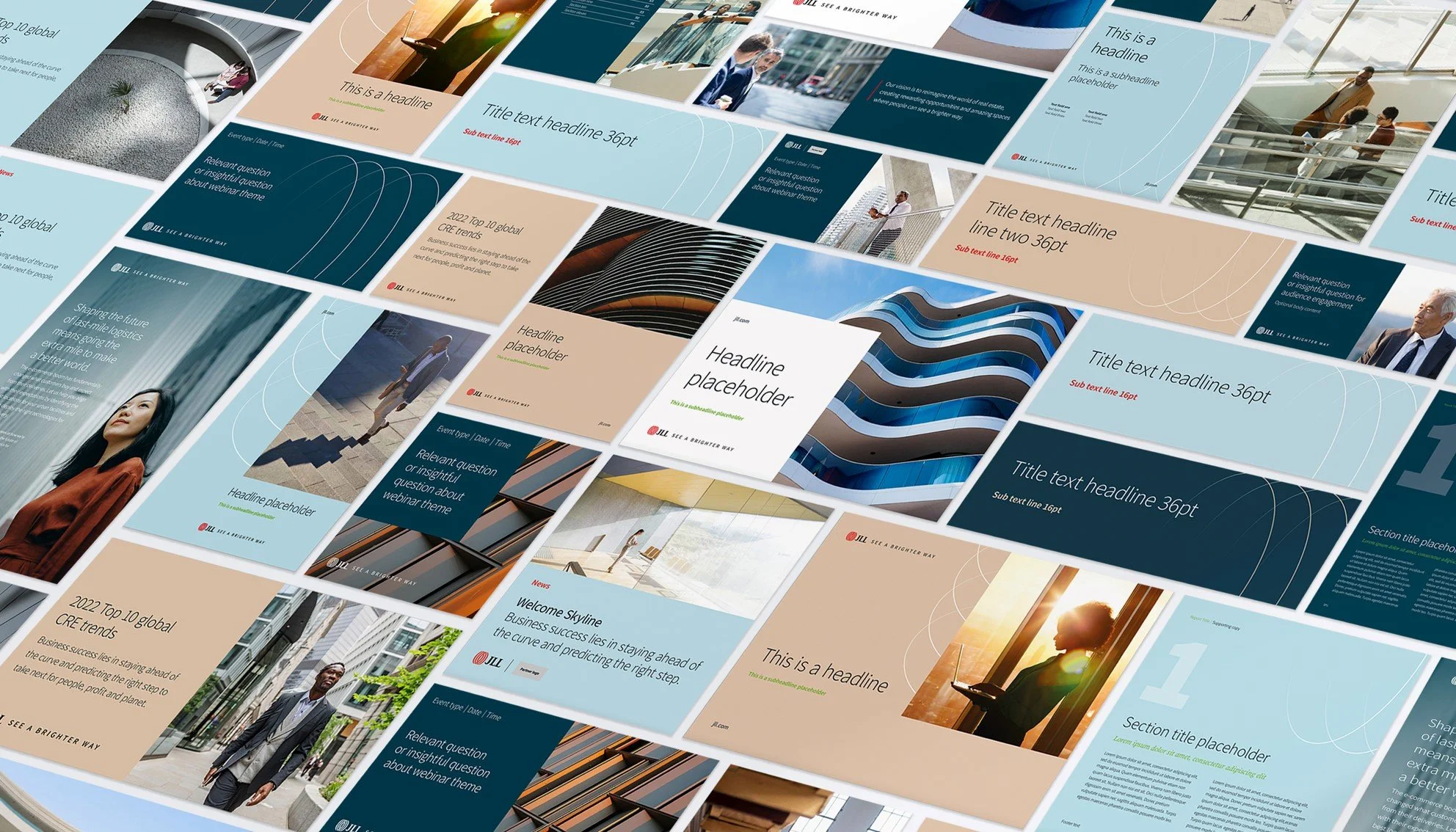
JLL Rebrand 2022
WHAT WE DESIGN
Logos & identities · Brand systems & guidelines · Characters & imagery · Campaigns · Brochures & print · Signage · Digital & Online
SELECTED WORK
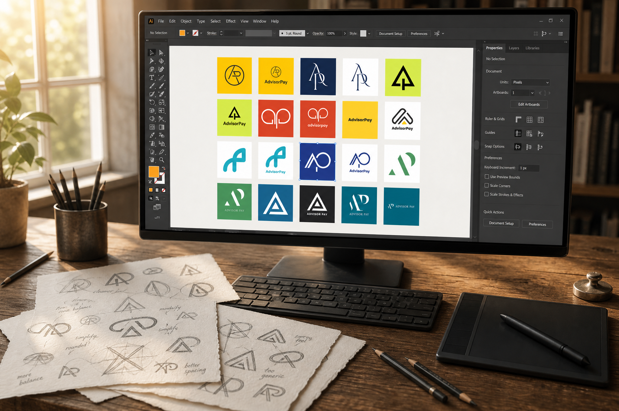
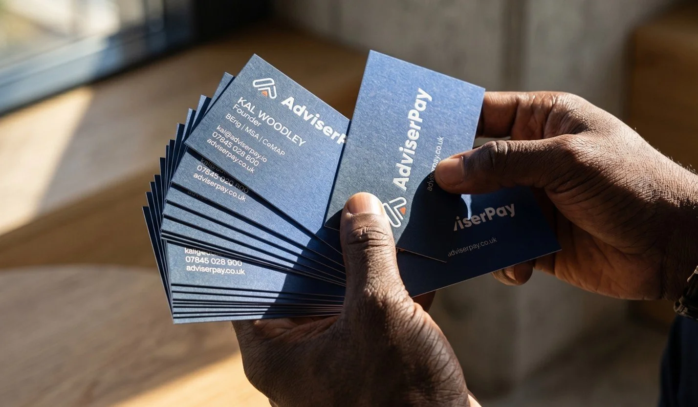
ADVISERPAY · Brand + Characters+ Imagery · Logos & Identities · Brand Systems & Guidelines · Signage
A FINTECH BRAND, BUILT FROM SCRATCH.
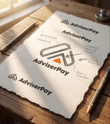
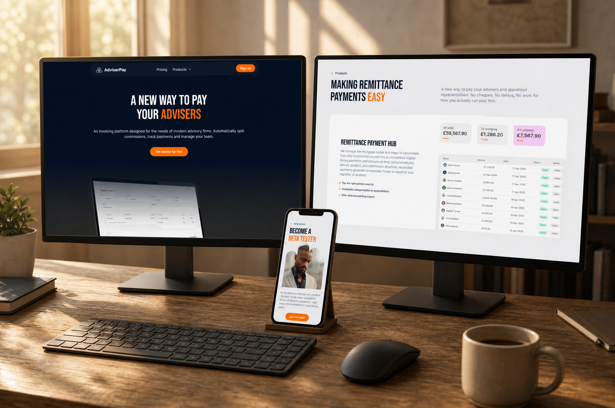
The brief. A new fintech mortgage product with no name recognition, no visual identity and no history, launching into a market where trust is everything. Advisers don't take risks on unknown platforms, so it had to look credible from day one and land with the people it was built for.
The idea. Every piece, from one studio: the logo, the identity system, a sculptural hero imagery style in navy and orange, print, video strategy and event design. At the centre of it, five character archetypes – Simon, Amira, Jodie, Kwame and Clare – built to represent the adviser community and work alongside the logo as a recognition tool. A logo tells people who you are. A face gives them someone to recognise.
What it did. With one designer behind every piece, AdviserPay looks the same everywhere it appears – on a phone screen, a business card, or six feet tall on the Mortgage Expo stand, where people recognised it before they'd read a word. No agencies to brief, no mismatched suppliers, one consistent look from the first sketch to the show floor.
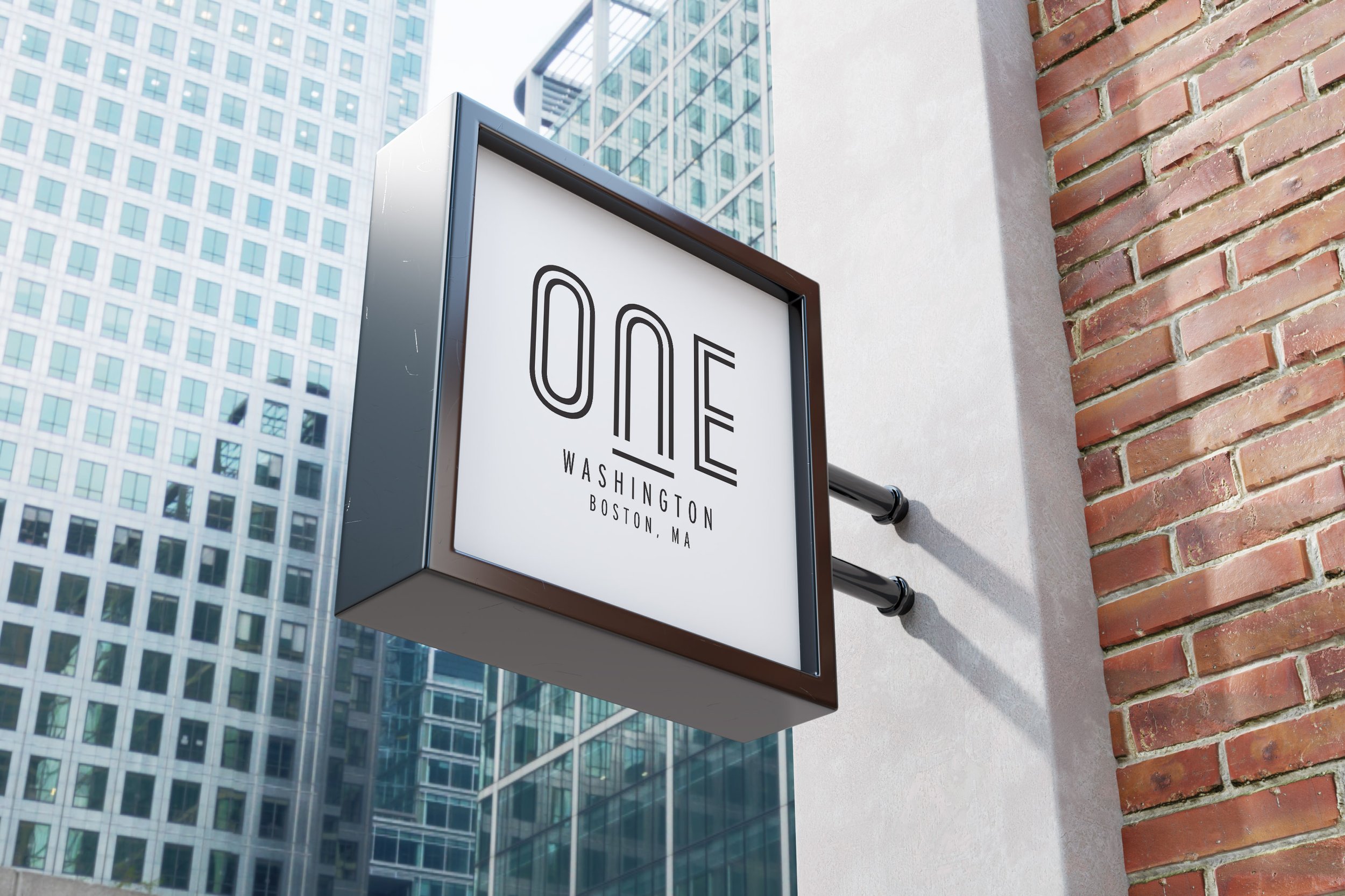
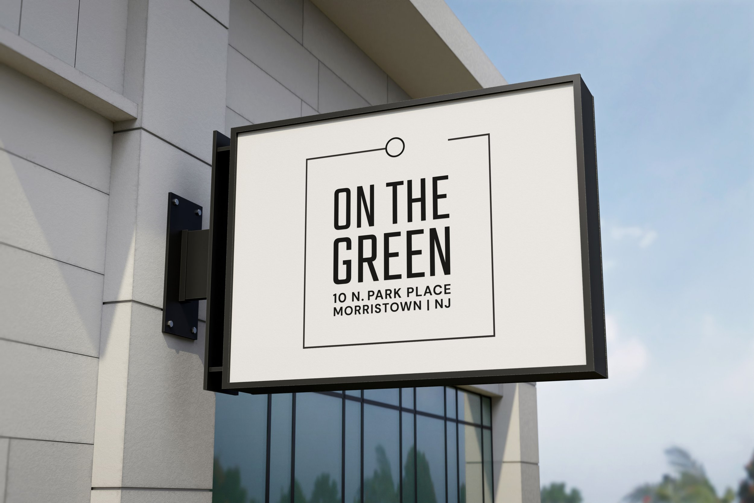
JLL · LOGOS & IDENTITIES
START WITH THE BUILDING.
JLL brought us in to create identities for commercial properties across the US. Each one had to attract tenants and investors in a market where every building claims to be the best address in town. Our answer every time was to look at the place itself, and find the mark already hiding in it.
ONE WASHINGTON · BOSTON
A major refurbishment of a large office building, with one clear requirement from the client: the number 1 had to sit at the heart of the design. After researching the building and its surroundings, we found it in the architecture – the building's own window grid forms the shape of a 1. The mark carried through to signage and a full brochure for prospective tenants and investors.
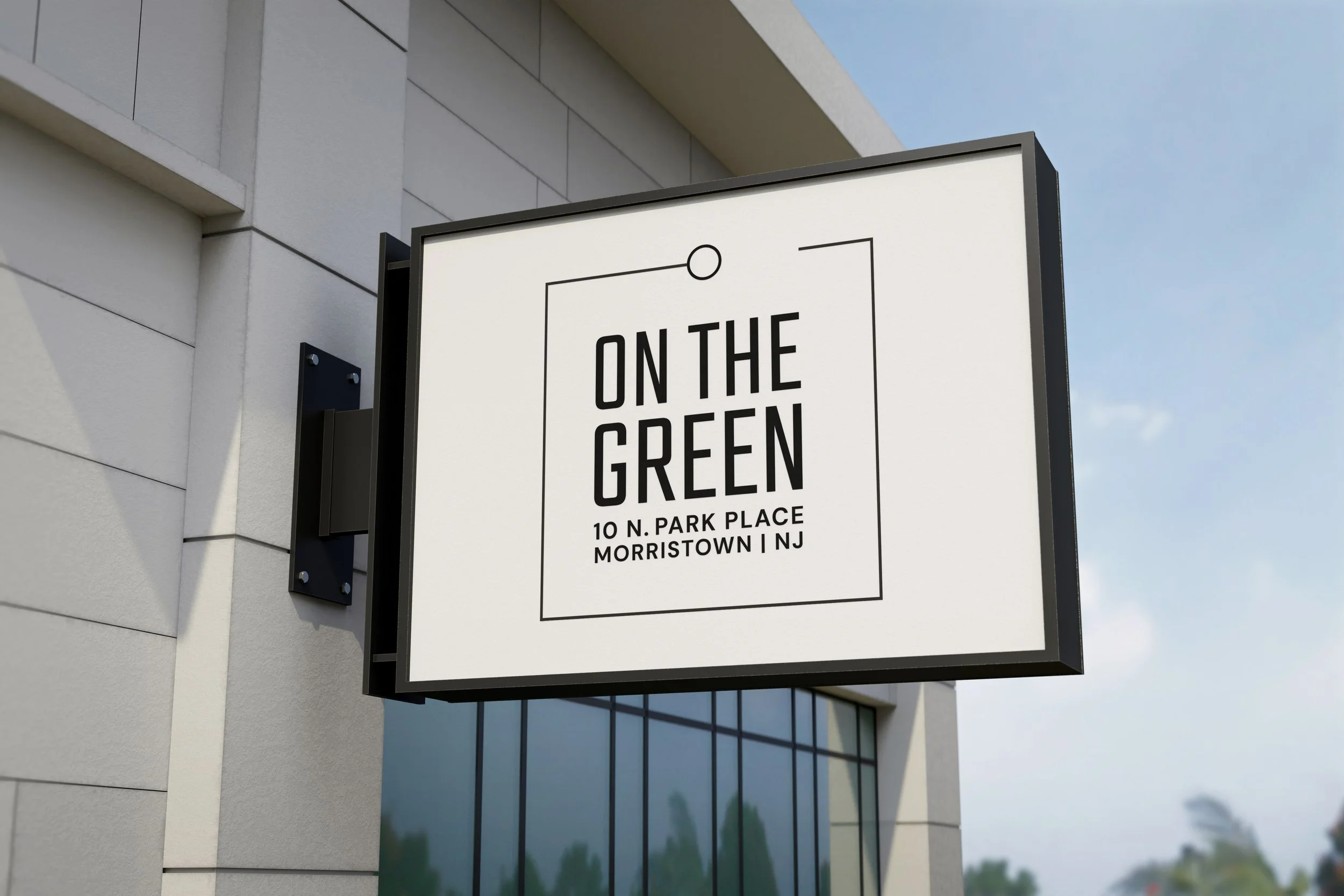
ON THE GREEN · MORRISTOWN
Office and street retail space directly across from a well-used green, surrounded by coffee shops, restaurants and transport links. The client wanted a logo that worked harder than a typical mark and sold the location as much as the building. The chosen design calls out the nearby station within the mark itself, tying the property to its place in the neighbourhood.
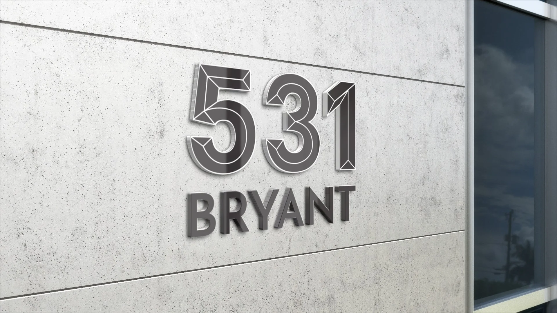
531 BRYANT · SAN FRANCISCO
A brand-new building with nothing to go on but a handful of early architectural visualisations. The logo had to speak to the neighbourhood's industrial past and its future as a tech and innovation hub. We took our cues from the building's large windows and muscular metal frame, and the client chose the boldest option – a mark built around the window-frame motif.
Identities built this way can't be mistaken for anywhere else, because they're drawn from somewhere real.
JLL · Campaigns · Brochures & Print · Digital & Online
ONE BRAND, MANY MARKETS..
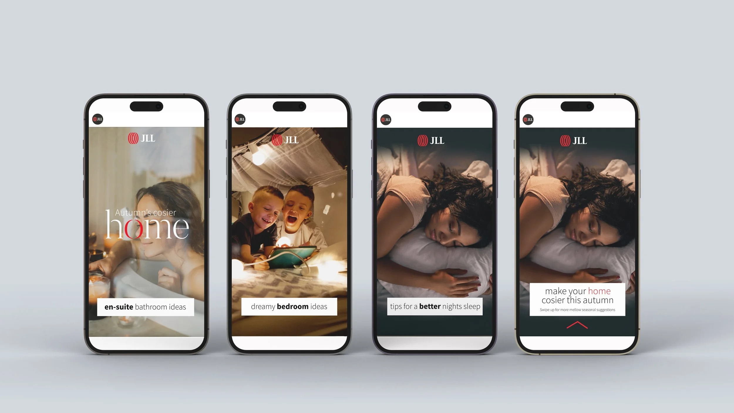
As part of a three-year global creative contract with JLL, we ran campaigns across EMEA and APAC. The challenge was always the same: one message, many markets, and no loss of consistency along the way.
BUSINESS FIT · EMEA
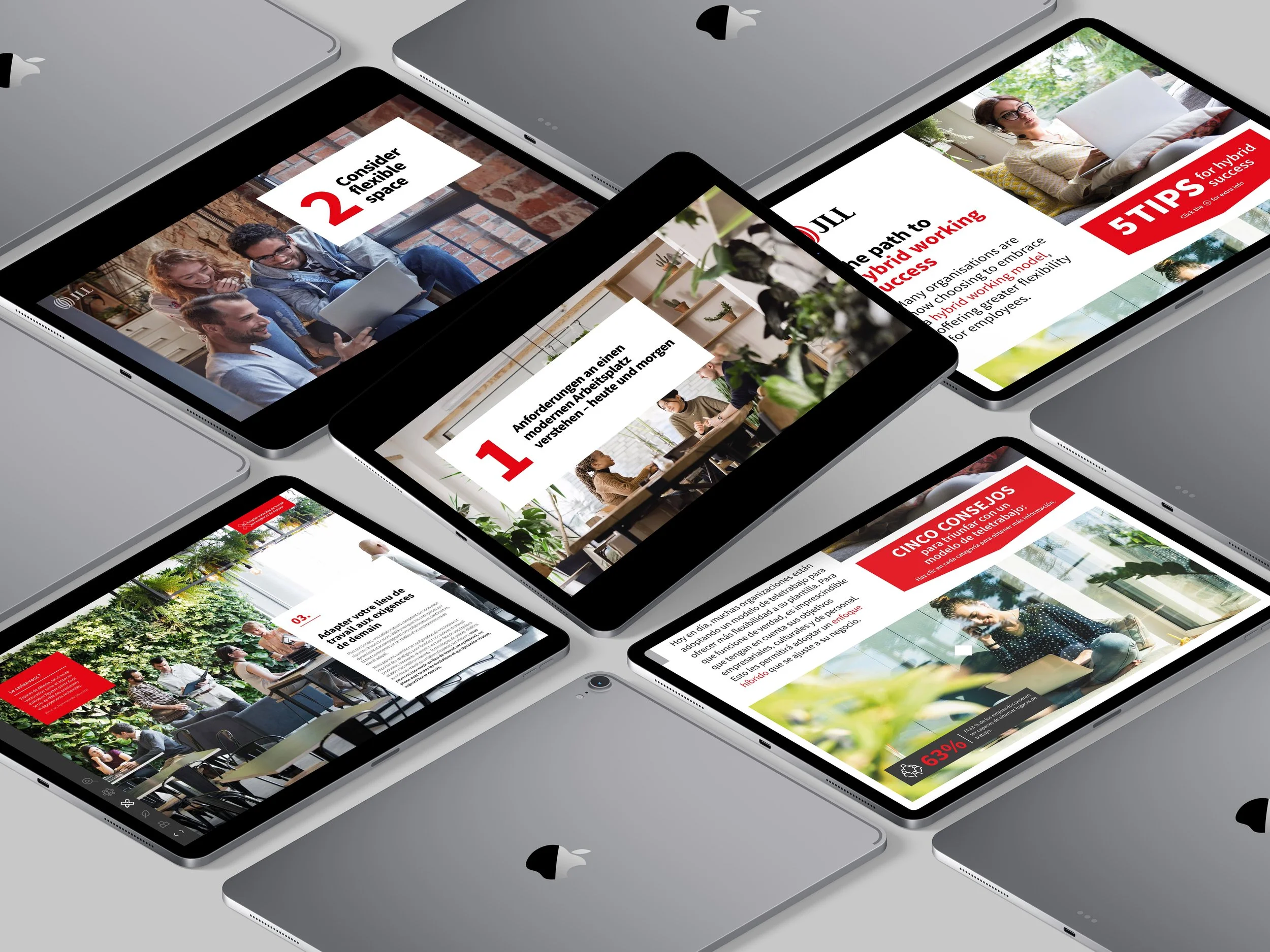
Built on a simple idea: the right office directly affects how well people and businesses perform. The campaign ran in English, French, German and Spanish, across videos, brochures and interactive documents – the same tips, the same design, in every language. It worked well enough to be extended into further phases in 2023.
INVESTED · CAPITAL MARKETS
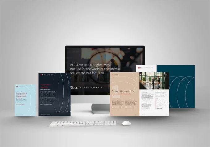
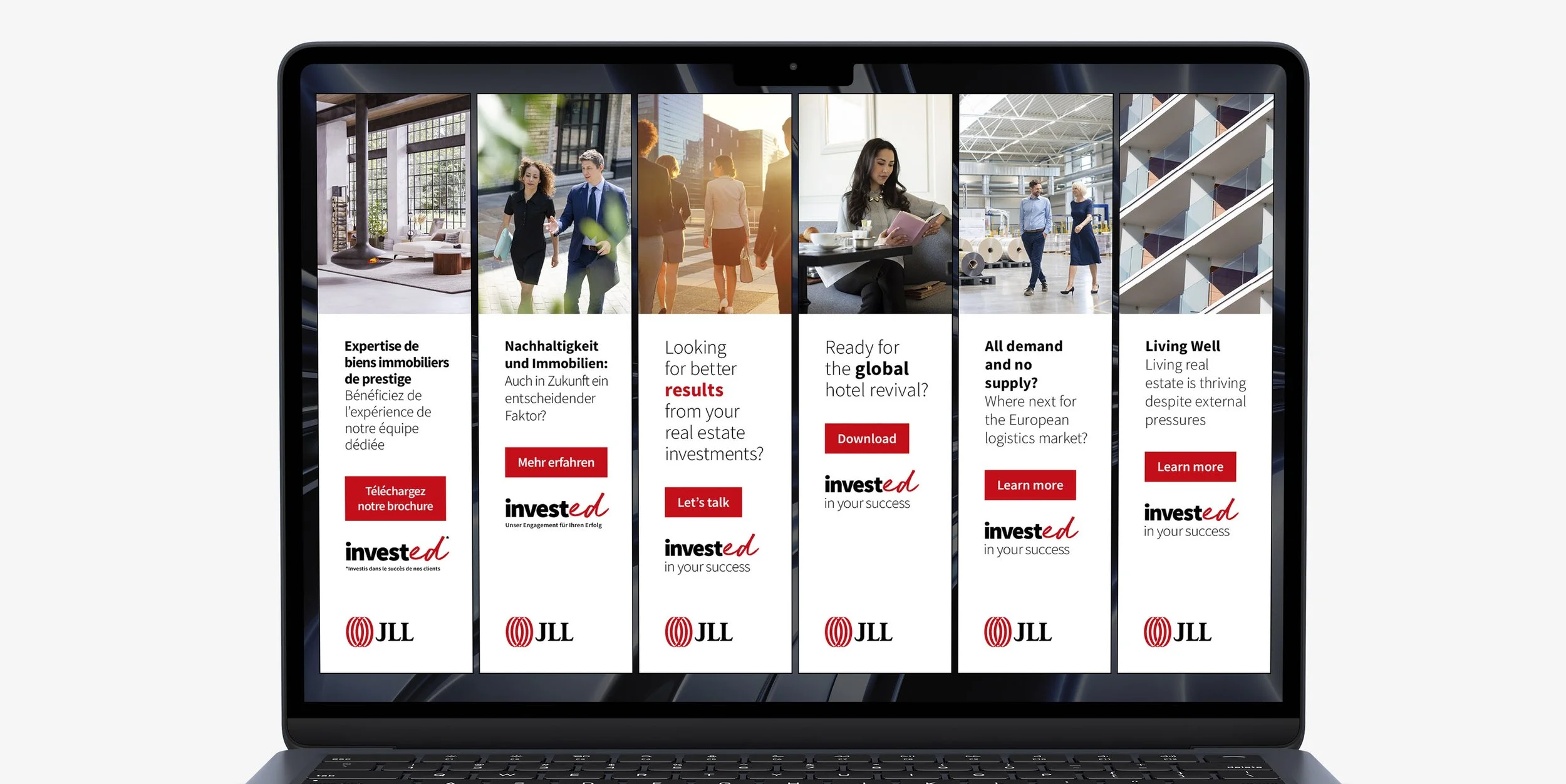
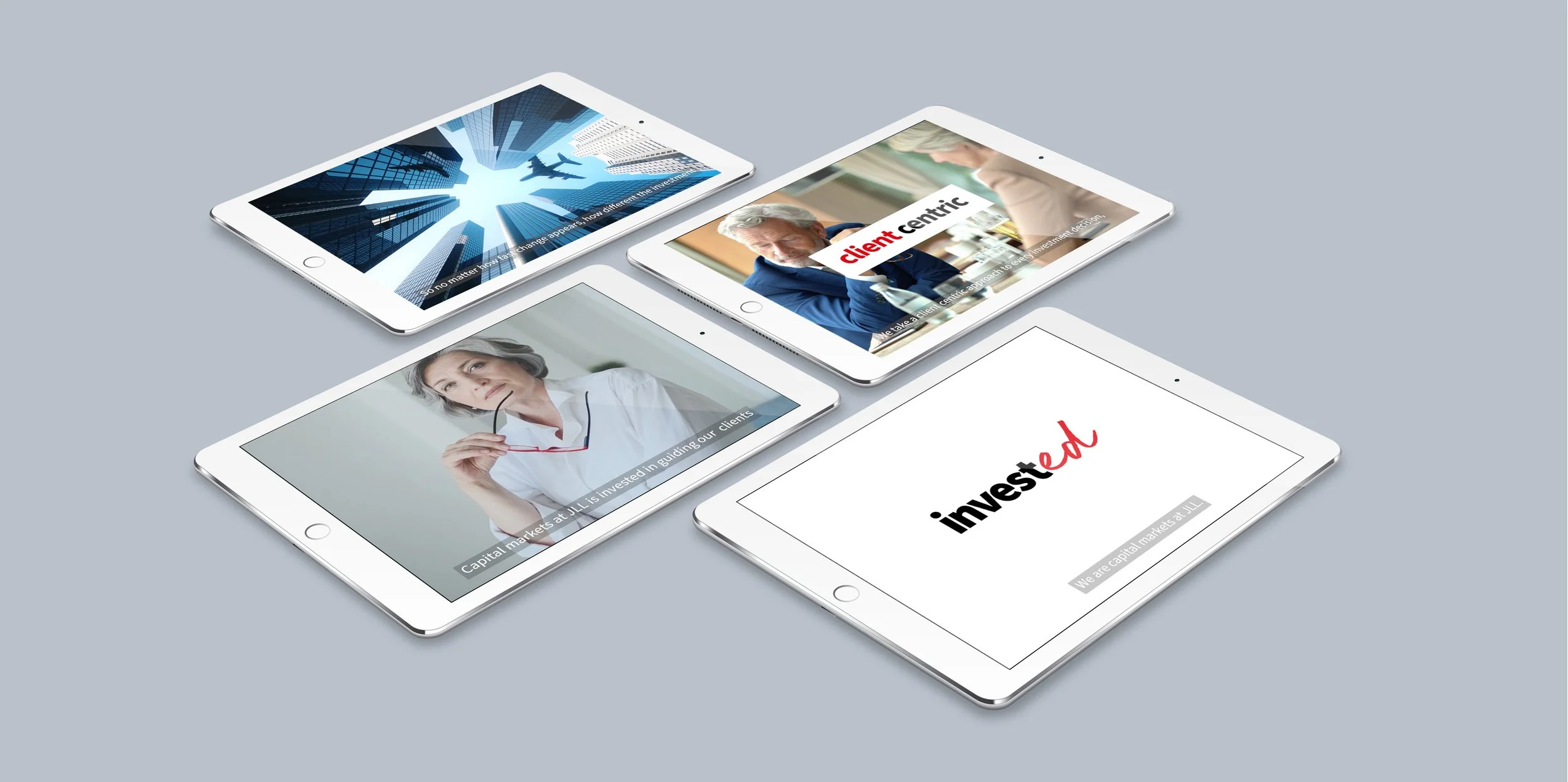
JLL brought all of its investment activity under one brand, and we produced the full 2022 campaign: digital, print, video, banners and outdoor across EMEA and APAC. Halfway through, JLL refreshed its global brand, so we updated the whole campaign mid-flight without missing a beat. JLL's Global Head of Marketing for Capital Markets called it a huge success.
SIX PILLARS · CHINA
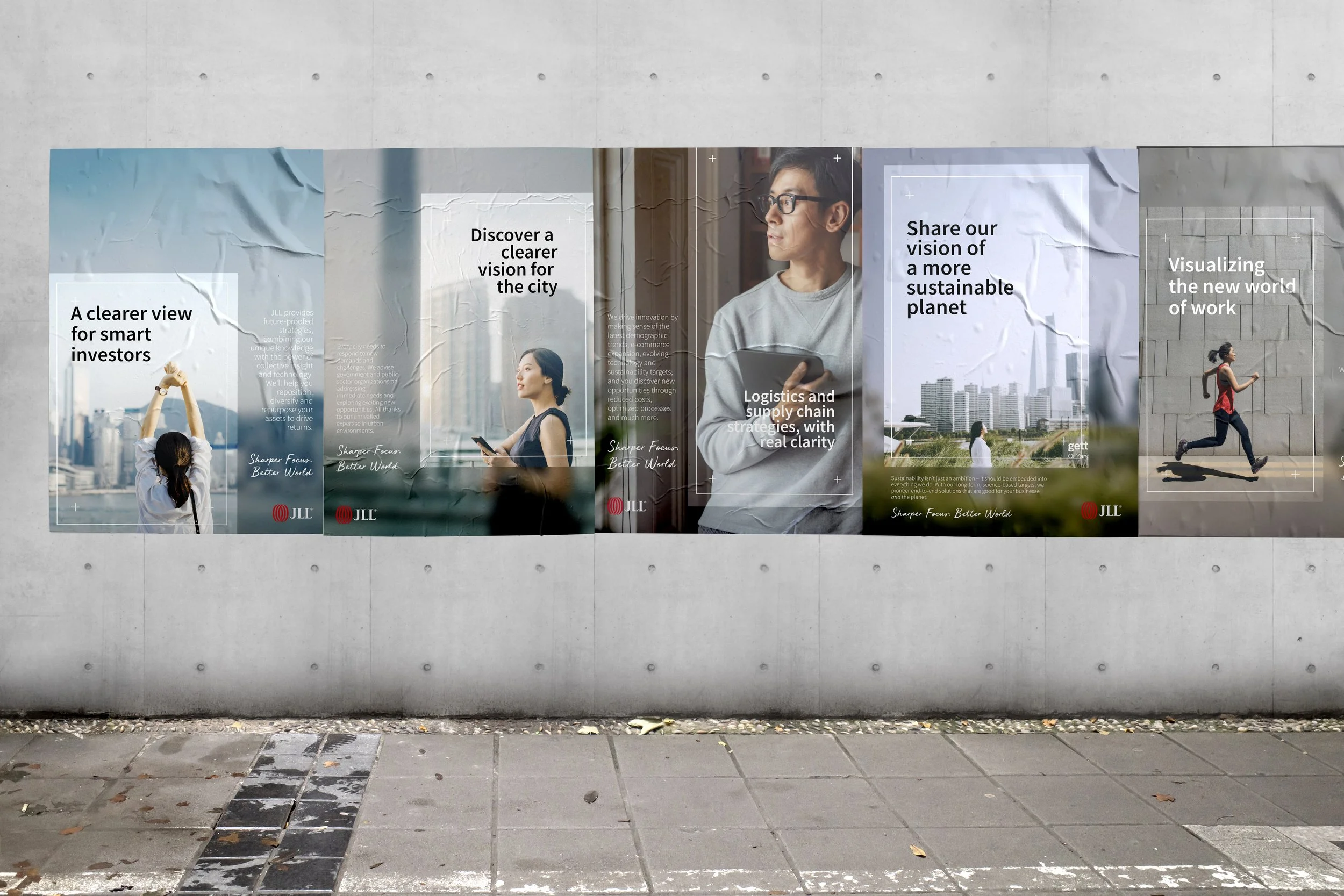
A campaign in English and Chinese, where messaging has to work within a local government context as well as a commercial one. We landed on clarity and vision: a viewfinder graphic frames the key message in sharp focus while the rest of the photograph falls away into blur, a visual metaphor for cutting through noise. The client signed off the design and the photography without a single revision.
WHY WD CREATIVE
25 YEARS. GLOBAL BRANDS. YOU DEAL WITH ME.
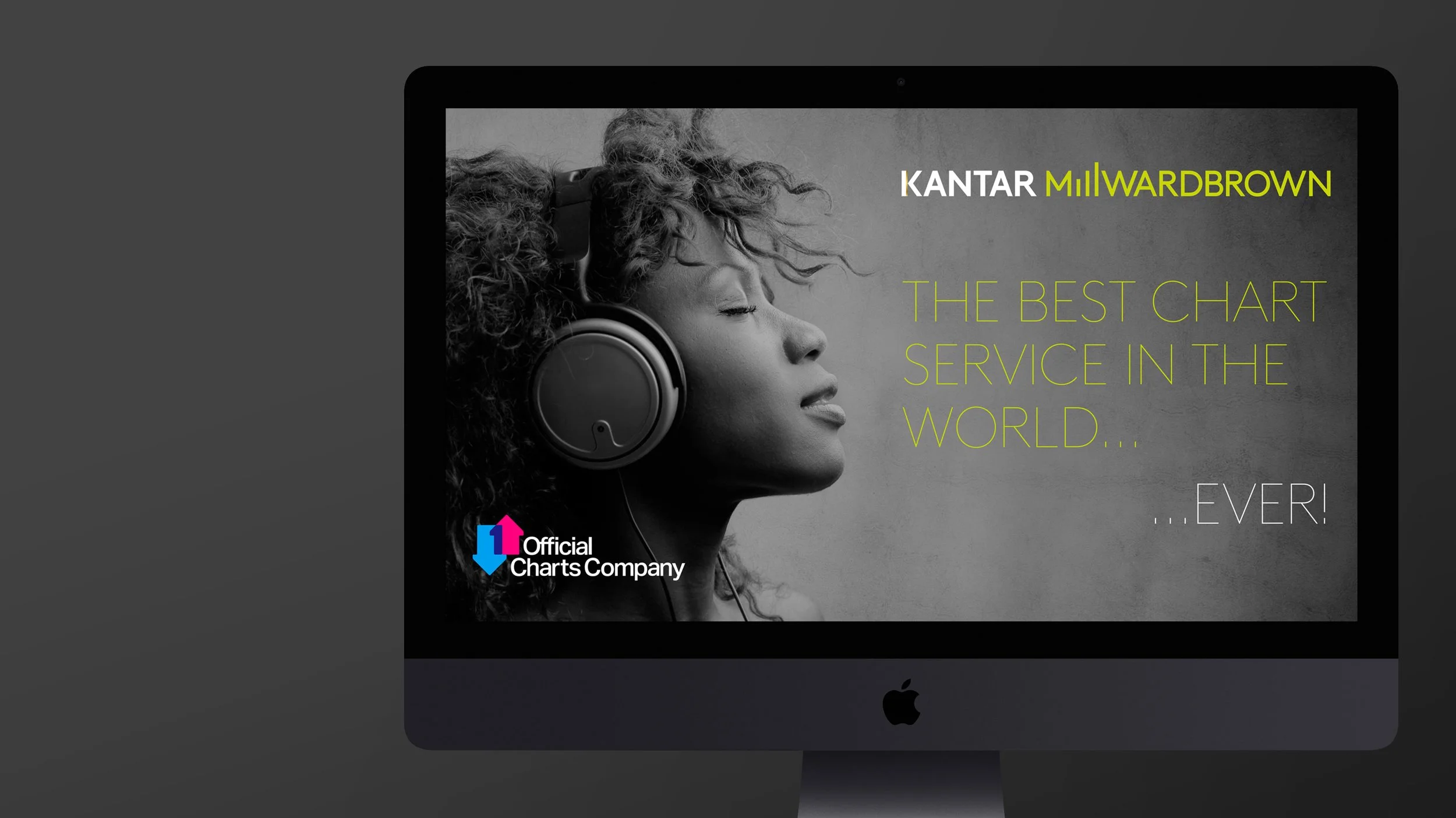
I spent over ten years as a Design Director at Kantar, working on brands across almost every sector – FMCG, automotive, energy, finance – including Coca-Cola, Unilever, PepsiCo, Shell, Castrol, HSBC, Visa and Audi. I sat on the WPP Creative Council, then went on to win JLL's three-year global creative contract.
That's a lot of big rooms, tight deadlines and senior audiences, and every project gets the benefit of it, whatever the budget.
No account managers, no juniors – the person you brief is the person doing the work. Same standard whether it's one pull-up banner or a full build.
One studio can cover everything an event needs: the brand, the stand, the screen content, the film and the photography. Fewer suppliers, fewer handoffs, and it all looks like it came from the same place.
Based in Warwickshire, working with businesses across the UK and internationally.
IS YOUR BRAND PULLING ITS WEIGHT?
Maybe you're launching something new and starting from a blank page. Maybe the logo was done in a hurry years ago and the business has outgrown it. Or maybe the brand looks slightly different on the website, the brochure and the stand, and nobody's quite sure which version is right.
Whichever it is, tell me where you are. Book a twenty-minute chat, no charge and no hard sell. Within 48 hours I'll come back with some first thoughts, a fixed quote and a timeline. From there, I lead the project myself, from first sketch to final files, with you involved at every stage.
Logo Refresh · from £950
Your current logo, redrawn and brought up to date, with a simple colour refresh. Supplied in every version you'll need – stacked, horizontal, wordmark and logomark – with all the design files.
Logo & Identity · from £1,750
A logo, colour palette and type, with simple guidelines to keep it consistent.
Brand System · from £4,500
The full identity: logo, imagery style, templates and complete guidelines.
Total Brand · from £7,500
Everything in Brand System, plus a launch kit: stationery, a brochure or presentation template, social templates and event banners.